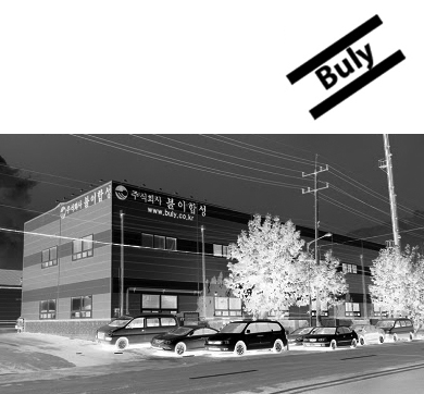
예술이 흐르는 공단 Industrial Complex Flowing with Art
사진 신경섭 Kyngsub Shin, Studio Zoom
@ (주)불이합성
Buly.co.kr
Why Bauhaus for this company:
The work is not directly a Bauhaus oeuvre but it is citing many traits from Bauhaus modernist raising many fundamental questions of craftsmanship versus mass production, the relationship of usefulness and beauty, the practical purpose of formal beauty in a commonplace object, and whether or not a single proper form could exist, which refers directly the product such as Buly produces.
One of the main objectives of the Bauhaus was to unify art, craft, and technology.
The machine was considered a positive element, and therefore industrial and product design were important components.
The word @tempo-o-o refers to the speed.
The Latin origin is tempus meaning time, especially the accelerated pace of production and life in the industrialized world, which is now again re/accelerated due to the internet.
The cuts and tempo/o/o separation refer to what have all machines of production in common, the interruption or cutting & assembling at certain time intervals.
Graphics> he flatness of the subject matches that of the façade itself. Note the extreme contrast between the scale of the photograph and the lettering. The text is in a period-looking font, set all in lower case, which was an innovation of the Bauhaus.
The colors are complementaries: black and white.
This is an elegant design using only type and letterforms, it has all the properties of their technological approach to functionalism: geometric, modular, minimalist.
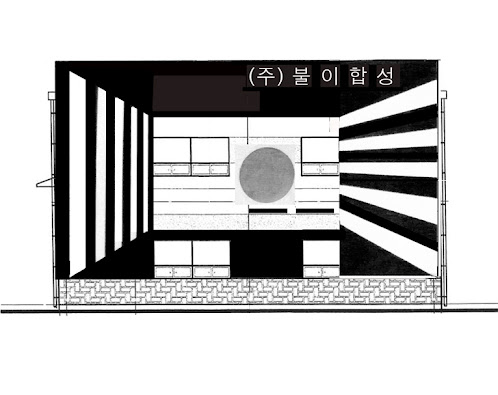
We show with this design a strong use of negative space, we believe that a façade design is not open to soft colors or contrasts. Façade design must be clear, pure, and due to it=s surrounding and due to the product of the factory which we took in count .
I am a paradox> refers directly to the product of Buly 불이합성, which is very sticky and at the same time it is not.
Material: Stencil, Enamel painting , Adhesive Sheet
'기능적인 것이 아름답다'는 독일 바우하우스의 이념과 디자인의 영향을 받아 고안한 작품으로 불이합성 공장 C 건물의 앞면과 측면에 검은 선과 글씨로 구성한다. 바우하우스의 정신은 모든 사람들이 편하게 사용하고 싫증을 느끼지 않도록 단순하면서도 조형의 기본원칙에 충실한 디자인을 하는 것인데, 안산 공단의 건물에 이런 이념을 도입시킨다. 첨부하는 디자인은 불이합성 건축의 특성(창문의 위치, 가로수의 위치)등을 고려하여 변화시킨다.
Oct. 2012


댓글 없음:
댓글 쓰기